The Colour Science behind Effective Logo Design
Something that few people may realise when coming up with a business logo is that you have to try to account for the ways in which people can interpret colour. What do you want your brand to convey emotionally? Making the right choices can allow you to help people feel a certain way about your business, and it’s all in the design. Take a look at any of your favourite company’s logos and their colour choices may tell give you a clue as to why you like them so much.
1. Yellow
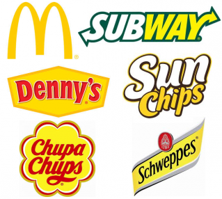
Yellow says clarity, optimism and warmth. Companies like McDonalds, Schweppes and Subway all use yellow in their logo to make you feel nice about getting something to eat, but yellow and gold can also be used to denote luxury and opulence. It’s also a difficult colour to make look nice, so be sure to speak to a professional designer like The Print Group before you move ahead with it.
2. Orange
Orange says cheerfulness, friendliness and confidence. Many brands who are aiming for a sense of fun employ orange – think of Nickelodeon, Fanta, and even the Firefox web browser. It’s about making the viewer feel like this is a company who likes to have a good time and want you to have a good time too, and helps put you at ease with their products.
3. Red
Red says excitement and youthfulness and boldness. Red’s a big one – you’ll see it everywhere because it’s so eye-catching. EB Games uses it, so does Nintendo, Coca-Cola and Toyota. It’s about imparting a sense of vigour and energy, and making people feel excited at the sight of their brand. Red is especially useful if you are catering to a younger demographic.
4. Purple
Purple says creativity, imagination and wiseness. Companies that use this colour in their logo tend to want the viewer to think of them as venerable, as an institution with years of experience in their field. Companies like Cadbury, Hallmark and Yahoo all utilise purple in this way to leverage the idea that, they know what they’re doing more than their competitors.
5. Blue
Blue says trustworthiness, strength and dependability. Products aimed at men are frequently outfitted in blue because those are the traits that men are typically looking for – something that’s going to last. Banks, also, are very partial to blue. Companies like Oral B, NASA and even Facebook want to leverage the idea that they are trustworthy, strong businesses worthy of your time and investment.
6. Green
Green says growth, peacefulness and healing. It is frequently employed by companies that would like you to think well of them. BP, Land Rover and Spotify all leverage the calm, loving embrace of green.
![]()
7. Grey
Grey says balance, neutrality and calm. Grey is excellent for companies that want to lend themselves an air of prestige or elegance. Apple, Mercedes Benz and Wikipedia all utilise grey in their logos to impart their superiority and neutrality.
As you can see, there’s more to choosing a colour for your logo than simply picking your favourite one. Thought, time and care must be put into the decision for it is a vital, but subtle, part of getting a customer in the door. Which colour would you use? Have you been drawn in by the colour of a logo before? Let us know in the comments below!